Tuesday 30 April 2013

Final Presentation: 29th April 2013

 by Yujin Nah


This is my final presentation of the first assignment for studio. My final presentation is
different to the one from the last crit. It use to have been layed out in two coloums, as
you can see in the picture below. Before, there was too much empty space between the
mass and void model and the drawings, which I didn't like, it gave me an uneasy feeling.
Also with this layout, I realized the steps of my process was hard to follow. But, by
arranging the layout in a straight line allows it to flow more easily from one step to the
other and makes it easier to read.
 
 
From my last crit, because of my light pencil weight, the lines of my drawing were not
visible. So, by adding darker lines and shadings improved the problem.

 
This is a closer shot of my first half of the presentation.


 And this is the second half.

 
Finally, this is the new mass and void model, which I focused on carrying the concept
of the contrast between the curve and edge. My site model is very circular and curved
just like my refined contour drawing, but I saw a triangular shape where the mass and void
is sitting in the photo, therefore I have used this to create an edgy triangular model.
This final mass and void model reflects the prism form I used for my wood, wire and paper
model, as well as harmonizing with the site model naturally.


Monday 29 April 2013

Mass and Void - Daniel Finucane

I decided on placing my mass and void model in this location over the latter because there was alot more opportunity to connect the mass and void model to the surrounding contour model. I saw the low gap between the two 'hills' as a sort of river that flows under the model.


 These triangles on the front of my model were evident in all of my wooden, planar and wire models, so i thought it was important to include them into my mass and void model.


The picture below shows the final model that I developed. I made it out of polystyrene which was very difficult to do and would have been impossible to hold together without the use of pins. The pyramid legs that I used help to support the model on different contour layers, as well as connecting my mass and void model to my wooden, planar and wire models through the triangular theme.


I think of the way the triangles point upward as being an infinite void, because the void would just carry on increasing in size if you drew imaginary lines extending out from the triangles.


Contour Model - Daniel Finucane

When I first started placing making my contour model, it was an exact map of my refined contour. I soon came to the realization that this looked very unrealistic as a land mass because none of the contours were going off the page. I chose to move each of the little 'islands' outwards and cut them so the created depth on the edges of my contour model. I think this was effective in making the model look more natural and it also made it seem like it is a closer up view of my refined contour. The placing of my wooden model was where I initially for the site of my mass and void model. But at this point I was not completely sure what the next task was going to be.


I placed strips along the bottom to help bring it to the required height of 75mm.

Sectional Drawings - Daniel Finucane

These are a few examples of my sectional drawings, one from each my planar, wooden and wire models. I have followed up on the fact that they were not dark enough and they now have clearer lines. I struggled with planar model because it was the hardest to judge where all the sections were truly supposed to be.

Planar

Wire

Wooden

Sunday 28 April 2013

Presentation Layout (crit) - Daseul Kim


This is how I presented my work at the crit we had on thursday 11th of April


Presentation for Critique with Kat and Campbell - Williamm Howse

Photographs of my presentation. Improvements to be made include the removal of the blue pins and replacement with clear pins. I will also present all my section drawings that were unable to be displayed in this particular critique, due to the lack of space.

Saturday 27 April 2013

Exploring Mass and Void Final Model- Leigh Garner

I have recreated my contour landscape as well as a new Mass/void model. I have taken my ideas from my last model and explored a different area of terrain to place it on, I felt my last model lacked some of the details I was trying to express from my Wooden model (the vertical and horizontal lines), I still wanted to run with the theme of organically growing the model around the landscape, incorporating it rather than just placing it on top. I have also chosen wood as my final material for the contours and clay for the mass/void model, this gives a nice natural finish.

I have created a brief video to explain verbally a little more about my design


Also here are some photos.

Front view showing vertical elements in foreground and horizontal in background

Looking through the vertical elements to see horizontal cantilevers behind.

 Birds eye view showing the structure moving out of the depression and up around the rise of contours.


Friday 26 April 2013

Section Drawings - clarence lee


Section Drawings
Wood Model - For this model, I chose particular sections to show two things. The first was to show how the drawings will increase and decrease in complexity. The second was to show that throughout this complexity, one can identify key pieces that hold the entire model together structurally.

Wire Model - For this model, I chose to set up the sections based on where the concentration of wires were the greatest. This approach arose due to the complexity of the model.

Paper Model - For this model, I realised that it was very similar to peeling off the layers of an onion. Thus, I sliced the model as it is to show how they are simply built as overlapping rings.

Final Mass+Void+Site - Clarence Lee


Final Mass + Void + Site
For my final iteration, I decided that I would treat the site as it is instead of some natural landscape. I thought that if I want a form to harmonise with the site I can complement it by creating a form that is heavy, light, angular, curvilinear or a mixture of these aspects. I also remembered that one of the tutors commented that most of our creations were highly monumental. This inspired me to create something different.

Looking at the site again, I saw how the contours pile above each other, emerging through what could have been a linear plane. To harmonise would be to in a sense come to terms with the general "flow". This gave me the idea of a form that looks fragile, light and hovers gracefully above the site. This was my starting point.

My main intention for the user was to create a form that can be easily relatable. I sought to achieve this by bringing out the beauty of order and to introduce light, nature and spatial depth to foster a meditative and sublime atmosphere. For this reason, the scale of the form was especially important. I did not want it to appear overly monumental, nor did I want it to appear too aesthetically overdone if it was shrunken. 

In terms of what I could glean from my previous work, I was once again interested in how the overlapping contours/rings of my wood and paper models could a) help me respond to the site and b) create the ideal experience for the user.

I also used the ideas from my previous iterations to help me arrive at this final form. 

Having done some research on Tadao Ando's ideas and work, I was influenced to try out the concept of using orderly forms to complement an irregular form. 

For this reason, I felt that the colonnades can give the final form a sense of rhythm and order. As a form, it also serves to visually mark out the gradient of the site, thereby complementing it. In terms of the users' experience, the huge colonnade that seems to support the sky will add to feelings of the sublime. The moving light during different times/weather of the day will also result in the bold and still shadows that will enhance the mood for contemplation. 

I have also decided to add a functionless bridge that connects the pillars that mark out the steeper approaches. These bridges will serve to enhance the users' approach, descend, helps frame the sky and also gives the overall form a sense of wholeness. 

The overlapping layers were created to lend emphasis to the gradient and the contours. What I was trying to achieve was to give the site a physical manifestation of its "genus loci" and depict it to be emerging directly from the site itself. I think I failed in this aspect as the layers i used did not fully achieve that sense of flight and drama. They were aesthetically too chunky.


Wednesday 24 April 2013

Lessons From the First Studio Project + Crit - Clarence Lee

Hi guys, seeing what Leigh has done, I thought that it might also be good to share some of the personal lessons which I have learned from Studio and the Crit in general. To be honest, there were times when I felt that it was a complete waste of my time haha. Nevertheless there were quite a few lessons that I picked up from the experience.

Studio Work
1. I think Studio Work is like a fight. You enter the "match" with a fixed amount of stamina and you have to plan your moves wisely so that you do not waste too much energy. To strike and miss is bad. To strike but not draw you closer to winning is also bad. Once you have a good idea of an iteration, you should commit your entire being into producing it; I personally prefer the idea of having fewer iterations but of good quality. However, stamina for studio still remains one of my biggest problems because when I do not believe in what I am doing, I tend to give slipshod work.

2. I think Studio Work is about learning how do handle restrictions and making the best out of these restrains. Perhaps, the more we give ourselves a "handicap", the more focused and concentrated our work becomes.

3. I also think preparation for Studio Work is really important. Other than preparing the necessary tools for Studio, there is also the idea of reading/exploring widely so that you can pluck ideas faster and therefore produce even more sophisticated and relevant work. In the concept art world, they call it "building your visual vocabulary". I think in the architectural world, it goes beyond just visual vocabulary - it's about being aware of other perspectives and concepts. It gets really daunting when I think of this...

Crit
1. I think it really helps train your oratorical skills. I am still looking into how I can be clearer of what I am doing throughout my design process, so that I can present even more complex ideas.

Anyway, here's are two links which I think are pretty relevant.

A) http://www.intlistings.com/articles/2007/top-100-architecture-blogs/

have fun drowning in the ideas...

B) http://archrecord.construction.com/features/critique/2011/1104follies.asp

this is quite an interesting work that is kind of similar to our current project...

Happy working ^^

Mass + Void + Site Iterations - Clarence Lee

Hi guys, my laptop died on me so all my studio relevant pictures, documents, photoshop, editing software are gone. I will have to wait until tomorrow when studio is open to take some pictures of my work again. Lesson learnt; save your archi-related work to an external hard drive ^^

Mass + Void + Site
1. Site

Creating the site was a rather straightforward process. I simply added more rings to the current contour, so that it would better resemble an actual landscape. I also decided that the gradient would result in a mount so that if I were to situate a structure, it would be an opportunity to deal with mounts/hills/mountains. However, on hindsight, I realised that I was not challenging myself to a more interesting site.

2. Mass + Void

In working on the Mass + Void relationship, I found myself rather interested in the process of cut and fill. It posited a challenging parameter to work with that I had to unravel. I think that in its essence, the process can be broken down into the act of addition and subtraction from a fixed volume (200%). What I think the tutors wanted was the hollowing out of volumes to create enclosed/semi-enclosed spaces out of primitive shapes and ensuring that the final form responds well to the site and the user. 

Pondering over the nature of the instructions also spawned 3 questions that I found instrumental to the design process particular to this project:
A) What is a Mass + Void relationship?
Having done some research on Tadao Ando and John Scott's work, this was an extremely daunting question to answer due to its complexity. I can only sum it up as an interplay between volumes and air to create relationships between light, shadows, atmospheres, materiality, textures, elements of nature, sounds and views, which results in a range of infinite emotions and experiences. And the skill of the Architect will determine the quality of experience that the user is put through.

B) What insights can I glean from the previous work?

C) How can this model relate to the site and how can a person use it?

As I am also concurrently working on my design theory, I felt that I could also take this opportunity to play with my approach. 

1st Iteration

For my first iteration, I developed my own brief that the site was to be a mountain of perhaps 3000m high in altitude. I thought that this scale would best mimic most real world projects. I then applied my sensitivity to the site. The following is an excerpt of my imaginary brief:

"Mountains have for generations been a highly sacred feature of cultures across time and space. In this time and age, their sublimity and relevance seem to be out of sync with the march of progress. I wish to re-establish this importance through Architecture. Through a thoughtful manipulation of mass and void, I hope that the resulting interplay between nature and space will inspire a peaceful inner dialogue."

I then decided to develop forms that were derived from the contours of the site. As I felt that one of the ways to inspire a peaceful inner dialogue is to put the user through a Journey Motif, I wanted the derived-contour-forms to snake up to the peak. This would allow the user to be confronted with multiple views of the surrounding scenery and therefore realise his humbling insignificance in this world.

Due to the Cut and Fill method, I used the additional forms to emphasise the verticality and the gradient of the slope. These additional forms would interact with the light to conceal and reveal the surrounding natural environment. 


I discarded my 1st iteration because I felt that it appeared boring and lacking in the qualities of timelessness. 

2nd Iteration

For my second iteration I decided to give myself the imaginary brief of a residential project similar to the Ando's Rokko Housing Project. I built upon what I developed in the first iteration and tried to create a residential project that evokes a grandeur and sacredness that is comparable to the Nepalese Mountain Temples. 


I discarded my 2nd iteration because I felt that I failed my objective. 

3rd Iteration

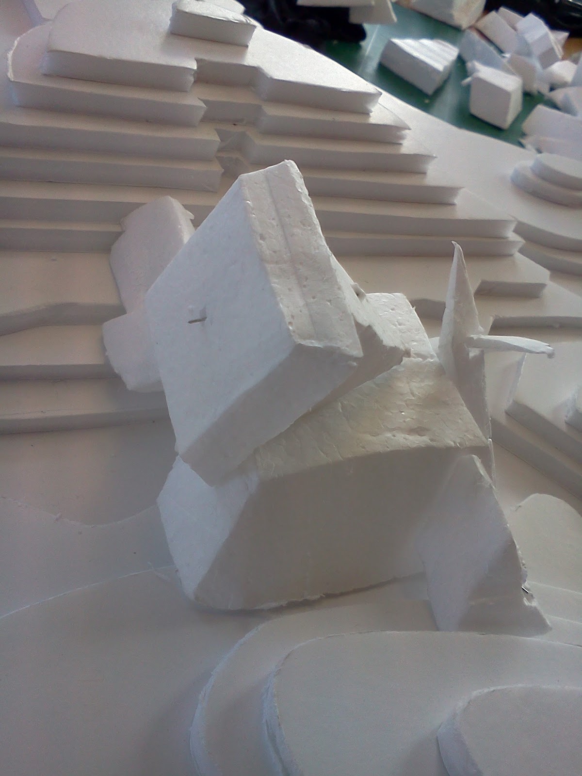
For my third iteration, I was a little frustrated that I kept failing to harmonise my ideals with the parameters. The cut and fill method was getting on my nerves. So I decided to change the scale of the site into that of a little mount. I also wanted to make my form more monumental so that it would be easier to create using polystyrene. I looked at the mount again and the idea of sharing a contemplative moment with nature resonated within me. It reminded me of the famous Romantic Movement painting, Wanderer Above the Sea of Fog, by Caspar David Friedrich. I wanted to capture and elevate that emotional depth. This was when I decided upon the idea of a monumental looking viewing platform. The imaginary brief I gave myself in the first iteration can find new expression in this third iteration. 


I carried out some exploratory sketches to develop these ideas before settling for this final design.

I settled for this form because I felt that it can formally be very relatable to different people. It is inspired by some of the architectural pieces from the Brutalist movement and by the idea of Ascension. I felt that such an aggressive form would complement the contours of the mount. I also wanted the interior to be sensitive to the human psyche. 
The approach attempts to put the user into a solemn mood as he exchanges the bright environment for an environment of growing darkness. From the approach itself, he can see light that illuminates the opening at the extreme end of the building. The dark interior attempts to give this light a new vitality that the user can transfix his gaze upon. I physically isolate the user and put him in an environment whereby the encroaching darkness forces him to confront his self. The overlapping gaps invite faint and soft light that can serve as a powerful metaphor to however the user chooses to see it. He might perhaps view it as a glimmer of hope, or warmth, or guidance in life. As he approaches the opening at the end, he is confronted by a view of nature, which I hope will lead to a peaceful inner dialogue. This experience is further enhanced by the experiences that he was put through from the approach onwards. 

However, this is not my final model for I felt that I might have been too eager to apply my ideas on existence to a project that is more interested in how an abstract form can relate to a site.

The following are pictures of the final product.


Tuesday 23 April 2013

Ink Blot Progression - William Howse

I selected the following ink blot as it contained an extensive amount of colour change. This would become especially useful when creating contour diagrams based on its composition. The outer edges tended to be a slightly darker while the interior of the blot lines were significantly lighter. This created an element of depth in this particular ink blot.


 Transitioning into a simplified contour diagram (below) would be the most successful compared with my alternative ink blots due to this colour variation.


Simplification of my ink blot (geometrically) involved the removal of quite a lot of the incredibly decorative edges, reducing them to general curves. I didn't, however, want to lose the 'character' of my ink blot when doing so - I therefore tried to not simplify to a greater extent and avoided drifting too far from the original design.

Experimenting with various chading techniques (below), I managed to portray my ink blot in many forms, some far more simply than others.

Poache-

Hatching-

Mixed techniques-


Sunday 21 April 2013

planar, wooden and wire models - Ross kingston


i found using wood for my models to be quite an interesting experience as I had never done any model building until now. It was quite hard when doing angles as gluing them was a problem because of trying to maintain that exact angle. these were the three mock ups I experienced with and made which gave me a great understanding of shape and filling the void.


My final wood model i found to be a success as it filled a lot of the void within my 3D acetate model and doesn't have the obvious shape of a pyramid as that what i tried to stay away from.this turned out to what i feel is the most successful model out of my three finals as i feel it meets the criteria quite well


I found working with paper wasn't as easy as i thought it would be because there were a lot of difficulties trying to come up with the shapes and connecting those shapes with an interior link to fill the void.

My final paper model was successful but i feel didn't capture as much of the void as the other two finals did. this i feel would be my least successful out of the lot but i did capture the shapes within the acetate model and applied it to my final planar model


wire was one of the most hardest materials to make models with as bending the wire into shape wasn't easy. When creating my wire mock ups I was filling the void but not exploring the entire acetate model.


My wire model was very successful even though it was one of the harder materials to work with. I utilized the shapes and the interior void of my acetate model and came up with a model that had a very abstract shape as I didn't try to concentrate on how the model looked but more concentrating on the void within the model and it really paid off in the end.